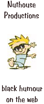
 The
original logo for the Nuthouse. Ugly as sin, ain't it? I had no
graphics programs at all when I started, save for a shareware copy of
Paint Shop Pro. There were a few different logos after this, such as
the "Happy Man" logo, designed after a doodle a girl
I was dating at the time used to do. But I lost that, and since I don't
happen to have many fond memories of her (aside from her having
an amazing rack), we're not going to attempt to redo it.
The
original logo for the Nuthouse. Ugly as sin, ain't it? I had no
graphics programs at all when I started, save for a shareware copy of
Paint Shop Pro. There were a few different logos after this, such as
the "Happy Man" logo, designed after a doodle a girl
I was dating at the time used to do. But I lost that, and since I don't
happen to have many fond memories of her (aside from her having
an amazing rack), we're not going to attempt to redo it.
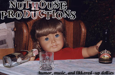
 Then was a picture of Sarah and Meredith flipping off the camera, which
was the "Saucy chicks giving you the finger" logo, and in the process
of restructuring, I somehow lost the
scan of that, which really sucked, because it was the start of coming
up
with snappy catchphrases for the site. Happily, Sarah seemed to have a
copy of it somewhere and was kind enough to e-mail it to me a while
back...
so there it is. Sexy, ain't it?
Then was a picture of Sarah and Meredith flipping off the camera, which
was the "Saucy chicks giving you the finger" logo, and in the process
of restructuring, I somehow lost the
scan of that, which really sucked, because it was the start of coming
up
with snappy catchphrases for the site. Happily, Sarah seemed to have a
copy of it somewhere and was kind enough to e-mail it to me a while
back...
so there it is. Sexy, ain't it?
 This
logo was made from a photo I shot with my dad over Thanksgiving at
my parent's house one year. Made my sister shriek like a banshee when
she
saw what we had done. The fact I used it as a logo really
pissed
her off. Not that I care, because everyone seems to find it really
funny.
I'm not sure if this was the picture I took, or the one my dad took.
Still
waiting for the American Girl doll people to file some sort of lawsuit.
This
logo was made from a photo I shot with my dad over Thanksgiving at
my parent's house one year. Made my sister shriek like a banshee when
she
saw what we had done. The fact I used it as a logo really
pissed
her off. Not that I care, because everyone seems to find it really
funny.
I'm not sure if this was the picture I took, or the one my dad took.
Still
waiting for the American Girl doll people to file some sort of lawsuit.
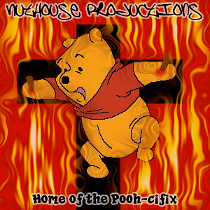 This
logo was made when I had just moved into my
own apartment. It took quite a while to find a picture of Winny the
Pooh that
would work with a cross. I wanted to give Pooh a crown of thorns, but I
couldn't get it to work. The nails turned out all right, though. Thanks
to Andy Morton of Danger Bob fame for telling me about the idea. Once
again,
I'm wondering where the lawsuit is.
This
logo was made when I had just moved into my
own apartment. It took quite a while to find a picture of Winny the
Pooh that
would work with a cross. I wanted to give Pooh a crown of thorns, but I
couldn't get it to work. The nails turned out all right, though. Thanks
to Andy Morton of Danger Bob fame for telling me about the idea. Once
again,
I'm wondering where the lawsuit is.
 Really,
Sean's a cuddly teddy bear. Yet, somehow, he scares the bejeezus
out of all of us. We live in constant fear of getting on his "bad"
side.
I wonder why? Anyhow, Paul took this shot in Sean's backyard. I stole
it
off Paul's fridge. I also have yet to return the picture to Paul. It's
was part of one of the many site revamps that the Nuthouse has been
through,
and kinda suited the rusted steel motif of the main page.
Really,
Sean's a cuddly teddy bear. Yet, somehow, he scares the bejeezus
out of all of us. We live in constant fear of getting on his "bad"
side.
I wonder why? Anyhow, Paul took this shot in Sean's backyard. I stole
it
off Paul's fridge. I also have yet to return the picture to Paul. It's
was part of one of the many site revamps that the Nuthouse has been
through,
and kinda suited the rusted steel motif of the main page.
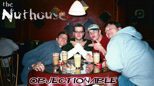 This logo was the masthead for damn near
five years. It was taken the evening of the whole "Honk For Dave"
extravaganza. The "Objectionable" quote at the bottom came from my
friend at the time Jen, who simply stated that she'd like the website
more if it weren't so objectionable. As soon as she said it, I told her
that she'd just came up with the new catchphrase for the next logo.
This is also the only logo to feature every member of the Nuthouse.
Except Rob. Who always seems to disappear.
This logo was the masthead for damn near
five years. It was taken the evening of the whole "Honk For Dave"
extravaganza. The "Objectionable" quote at the bottom came from my
friend at the time Jen, who simply stated that she'd like the website
more if it weren't so objectionable. As soon as she said it, I told her
that she'd just came up with the new catchphrase for the next logo.
This is also the only logo to feature every member of the Nuthouse.
Except Rob. Who always seems to disappear.